ASPhotoman
Huntington Tower 330'
-
Joined
-
Last visited
Everything posted by ASPhotoman
-
 It was only wishful thinking. My fingers are crossed that's their purpose.
 -
Would it not have been possible to do the office and apartment building in two phases? I understand they need to get shovels in the ground asap so Benesch can move in, but why not plan a second phase with apartments for if/when the TMUD gets approved?
-
I'm going to withhold judgement on the design until I see some better renderings. I'm really curious how the ground level looks now, and if they redesigned the alley.
-
There's a courtyard in the design, right? Any chance that these planters could be used for somewhere else? I sure hope so.
-
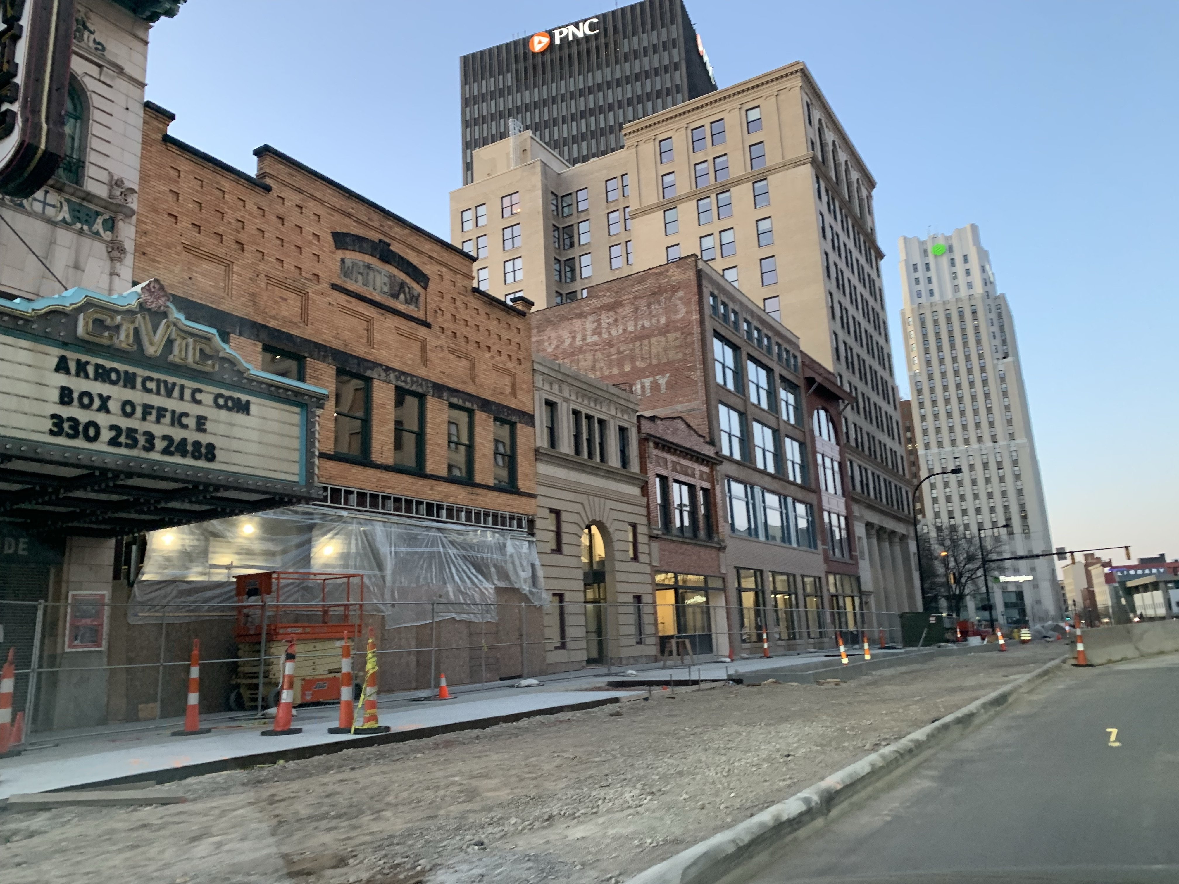
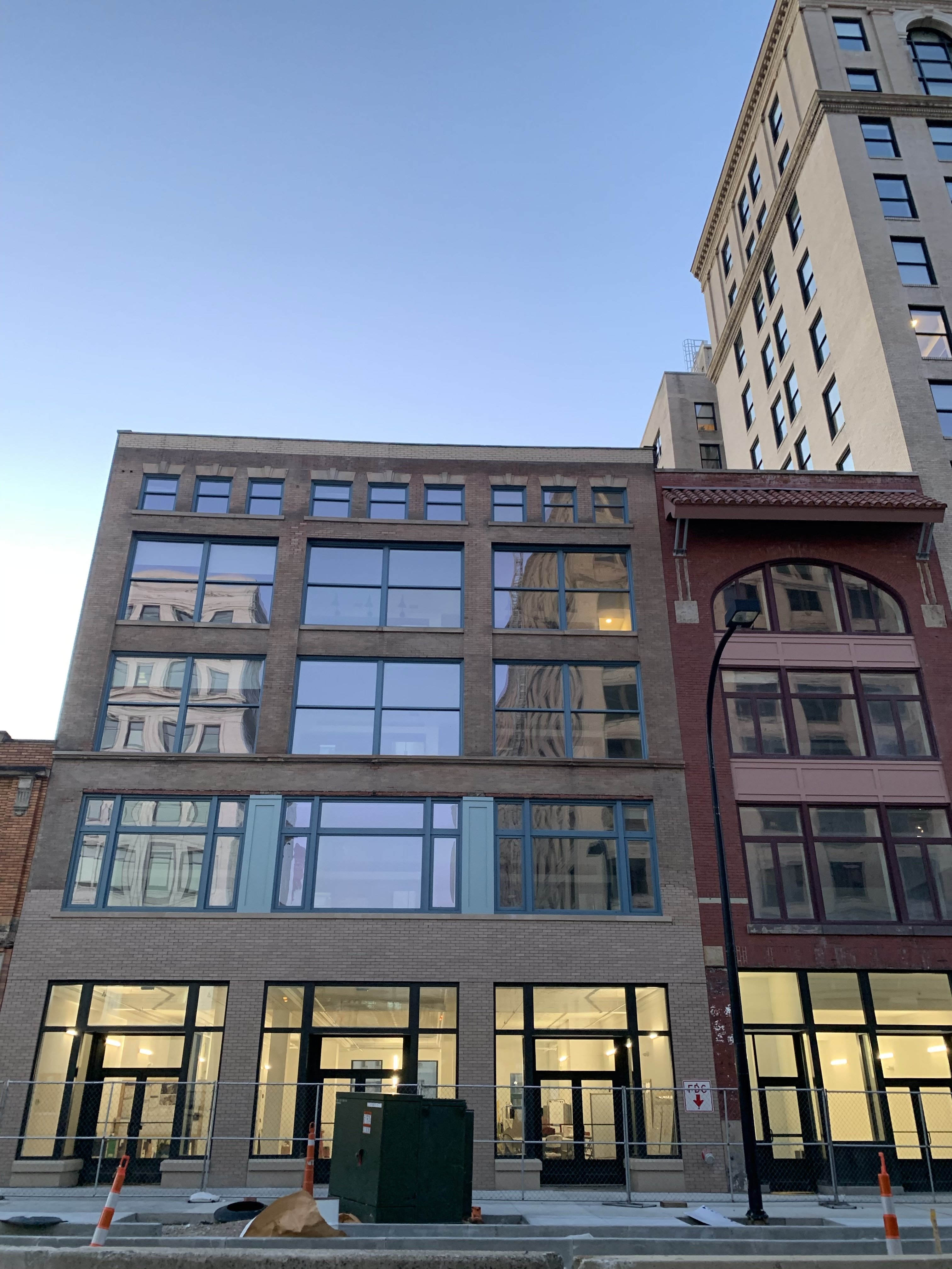
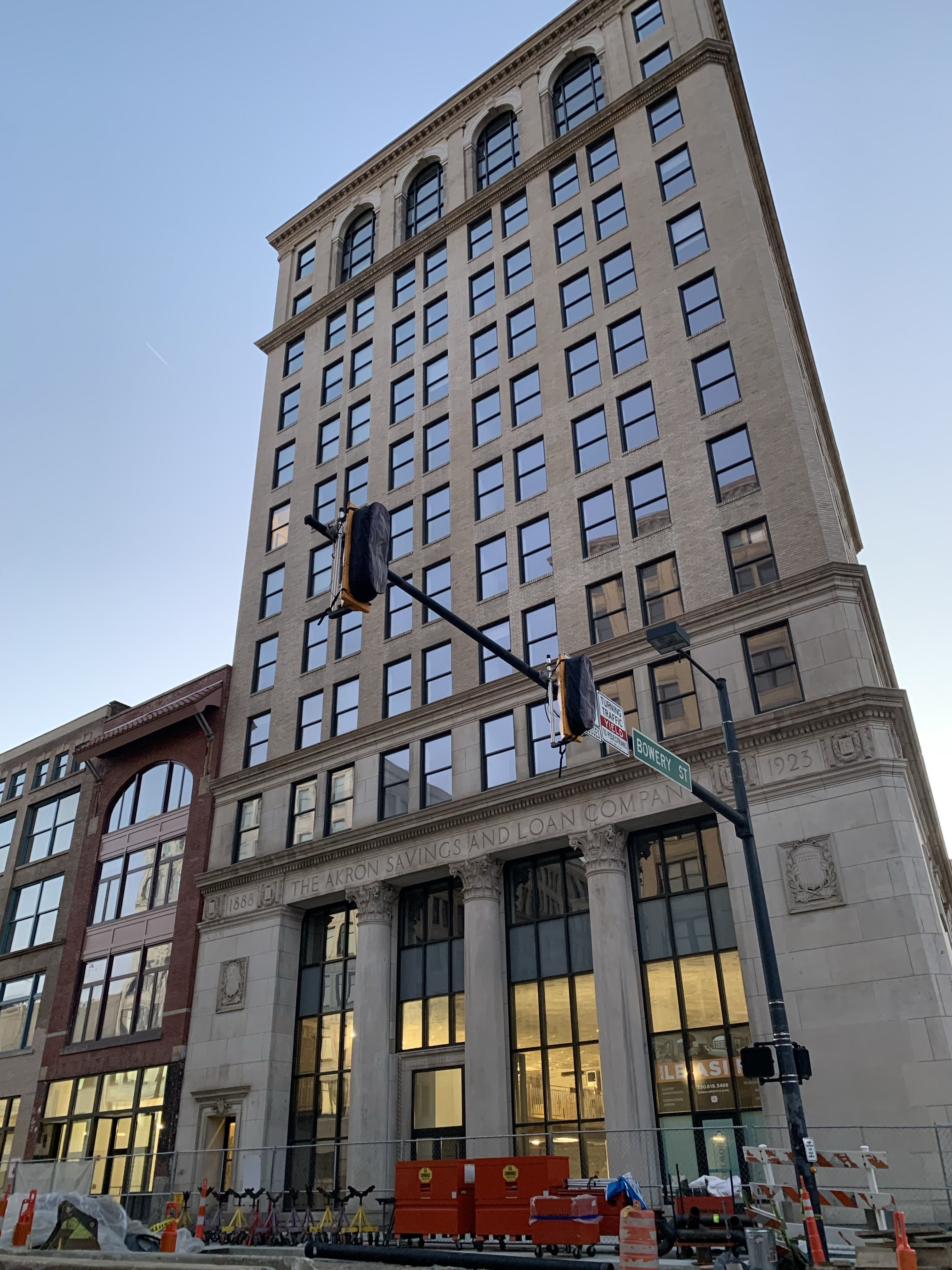
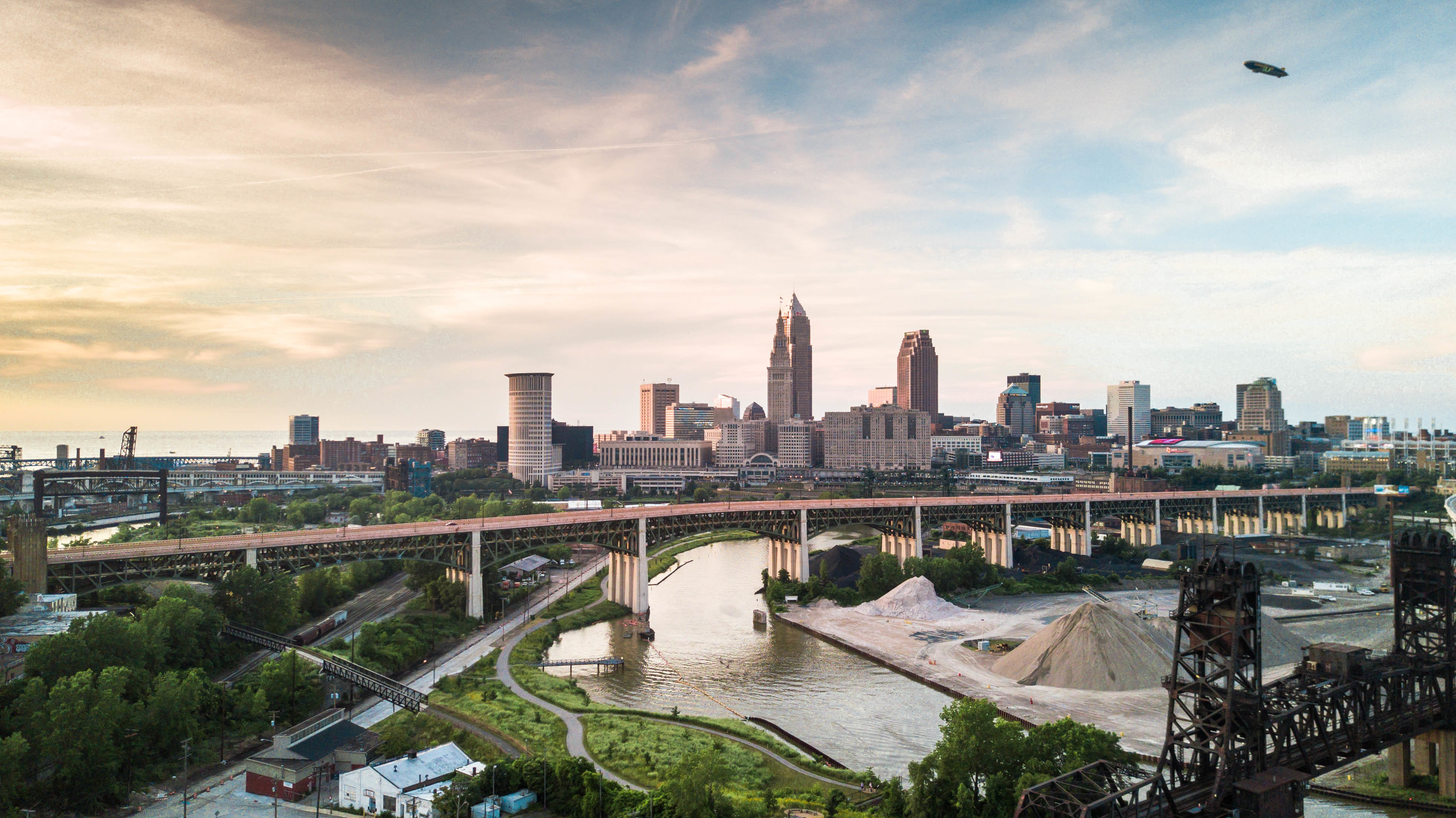
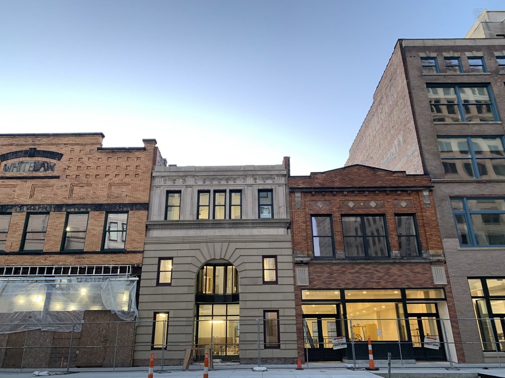
Some updated pics I took last week. The interiors of these buildings are looking so great! Can't wait to see what businesses go in.


-
Agreed. I've been wanting a building with this style to be built in Cleveland so bad.
-
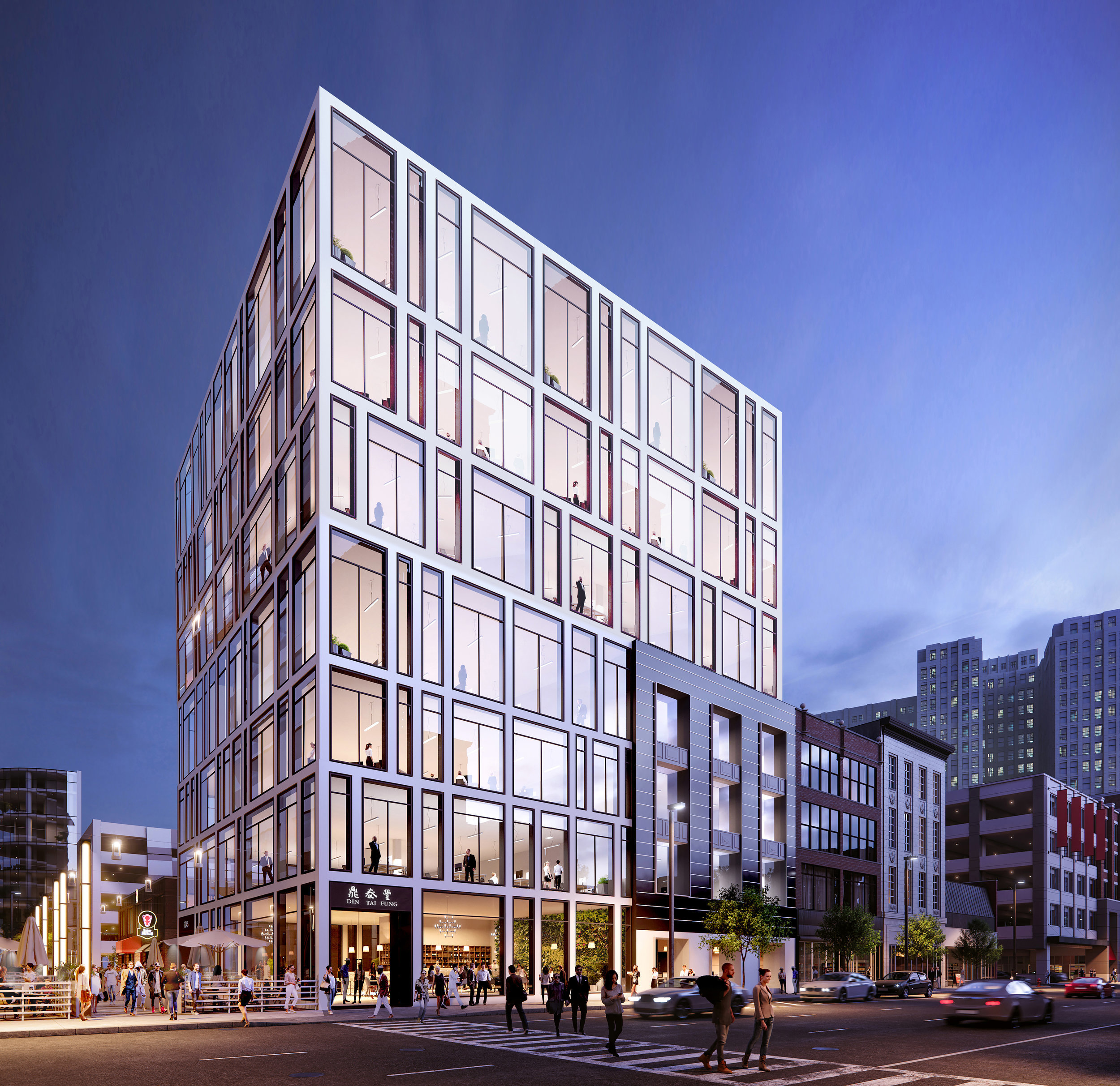
I didn't want to add to the off-topic discussion of the Herold building in the Nucleus thread, so I figured I'd add this here. I remember seeing this a few months ago, but for whatever reason I didn't post it. The link below is to a site that has more renderings/floor plans. It's nice to see they added some more floors from the original design. http://www.ainorm.com/hark

-
I don't think it's an LED screen...First, that'd be very costly, and second, it'd be so exposed to the interior of the garage I don't see it being a viable option. When I first saw the rendering, I assumed it was a space for large promotional banners like the Wicked promo rendering. I do think it'd be great for a projection, although I'd be curious how the projection would look from an angle considering the ridges of the curtain. If it was a projection they could project very cool graphics onto it in addition to promos. You'd also be able to control the brightness as to not have it be super bright during certain parts of the day.
-
Everything looks so high end. Love the grey accents in the sidewalk. Definitely beats the orange, red and purple found on Euclid sidewalks.
-
I'm guessing retail. I might be wrong, but it's my understanding "Intro" is name of the apartment complex.
-
Thanks, I completely missed that. If it's nice Monday, I'll head out for a drive and try and grab some pics. ?
-
It's supposed to happen this month, right?
-
After @KJP's last comment...I was hoping something good was on the horizon. ?
-
The Rockefeller building would make for an amazing hotel conversion. Not to mention being directly across the street from SHW. Would be nice to have more hotels in the Warehouse District.
-
Wow, so many floor plans to choose from.The interiors remind me a lot of The Beacon. Also, I feel sorry for the tenants with this view. ?
 It's coming along so well. Really excited to see what art installation will cover the parking deck.
The only thing I absolutely hate about this design is how exposed the parking garage is from above and the sides. I get needing to downsize the original plans, but how do you go from creatively designed spaces for people on the rooftop, to having a completely open parking deck from the top?! If anything I wish the apartment building were shorter and span the entire surface area than leaving the deck exposed.
There is something in the CPC agenda at bottom of the list that says The Beacon Canopy Signage. Seeing as they finished the signage for the entrance, perhaps this is for the top of the building as shown in renderings? http://planning.city.cleveland.oh.us/designreview/drcagenda/2020/03062020/index.php
Seems pretty on par with what the Beacon is going for.
Maybe like horizontal striped on a shirt make a person look wider; the vertical stripes give it a perceived boost in height?
That's what I was hoping it'd be.
That was at the earliest.
I asked them on IG if it was temporary since it looked half put together. This was their response.
It's coming along so well. Really excited to see what art installation will cover the parking deck.
The only thing I absolutely hate about this design is how exposed the parking garage is from above and the sides. I get needing to downsize the original plans, but how do you go from creatively designed spaces for people on the rooftop, to having a completely open parking deck from the top?! If anything I wish the apartment building were shorter and span the entire surface area than leaving the deck exposed.
There is something in the CPC agenda at bottom of the list that says The Beacon Canopy Signage. Seeing as they finished the signage for the entrance, perhaps this is for the top of the building as shown in renderings? http://planning.city.cleveland.oh.us/designreview/drcagenda/2020/03062020/index.php
Seems pretty on par with what the Beacon is going for.
Maybe like horizontal striped on a shirt make a person look wider; the vertical stripes give it a perceived boost in height?
That's what I was hoping it'd be.
That was at the earliest.
I asked them on IG if it was temporary since it looked half put together. This was their response. Thanks! Didn't realize it was just going to be projected on the curtain design. Unless you're looking at it straight on, I can't imagine that you'll be able to see what's there from any other angle. To me, the curtain looked like it was designed in a geometric way where you could flatten the panels and it would create a flush screen that would greatly increase the viewing angle of projection.