dave2017
One SeaGate 411'
-
Joined
-
Last visited
Everything posted by dave2017
-
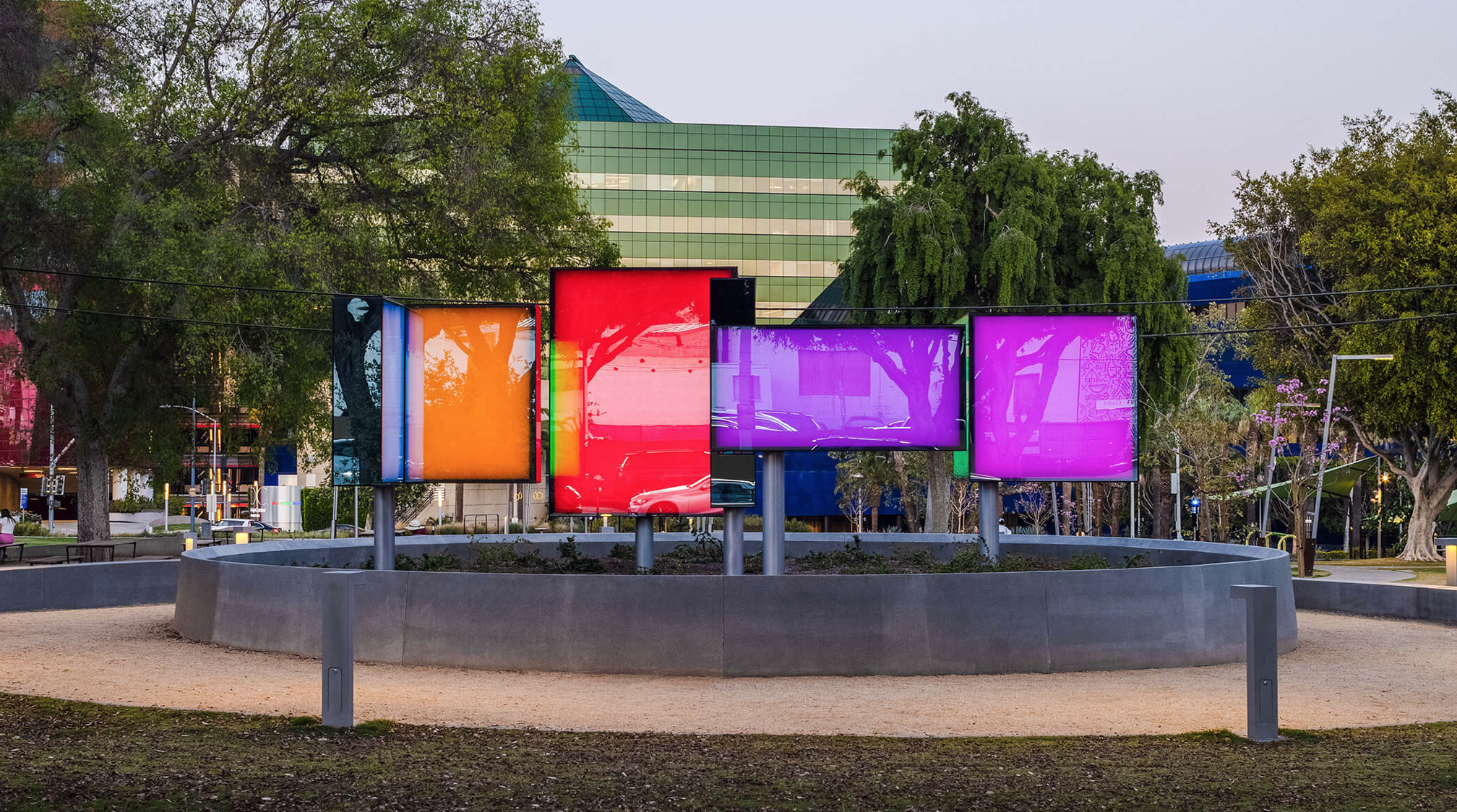
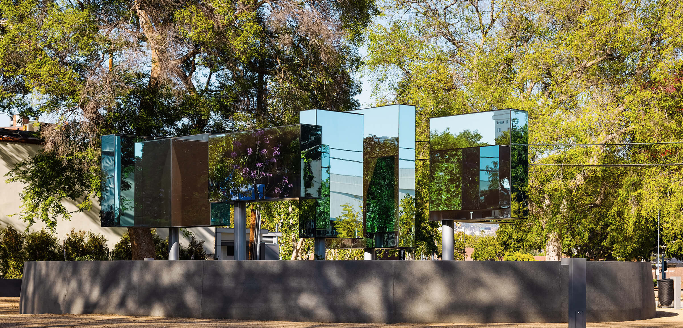
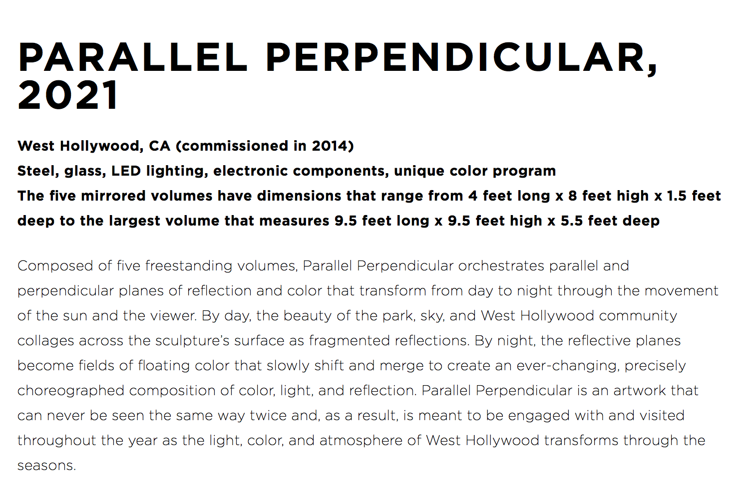
I always walk by this outdoor sculpture and wish that Sherwin Williams could hire the artist, Phillip K Smith III to design a piece to sit in front of The Pavilion. By day it is mirrored that would match the buildings glass and at night the panels turn into color fields. https://www.pks3.com/works/parallel-perpendicular

-
The digital boards remain. The LED panels were updated inside of them
-
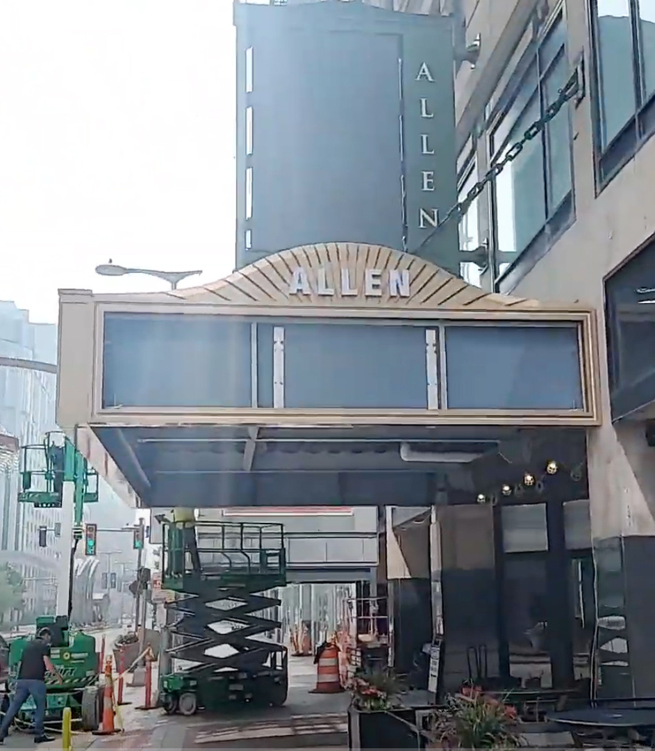
The Helen and Outcalt Theatre marquee needs to still be installed on The Bulkley Building as well
-
The issue is that the powder coated aluminum doesn't really age.
-
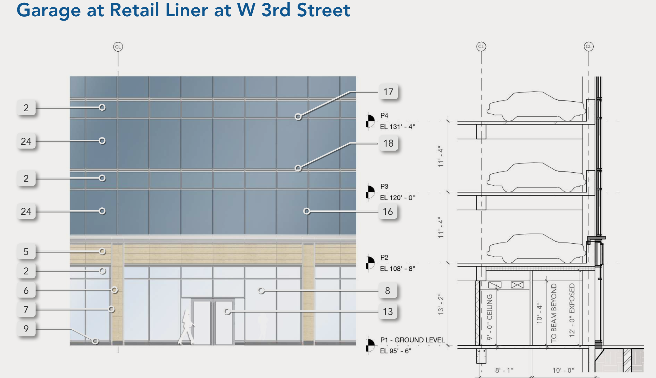
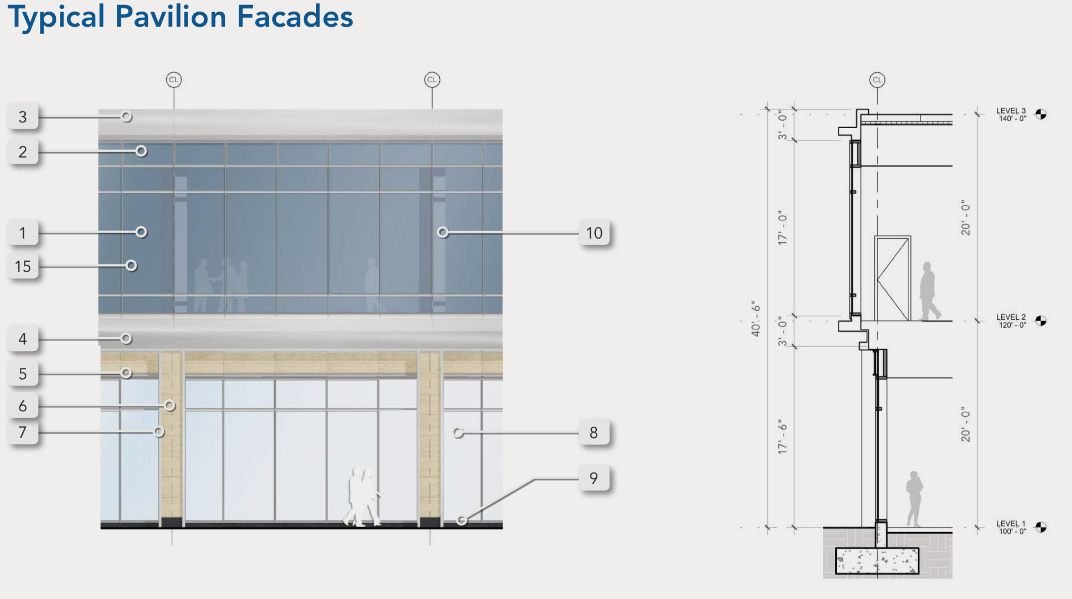
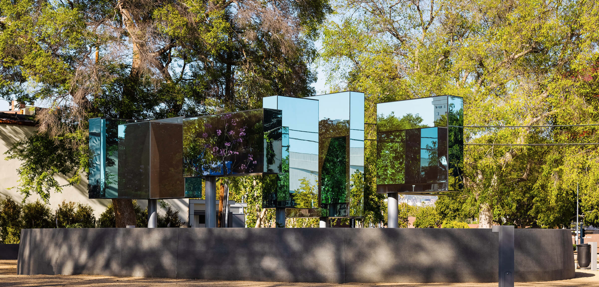
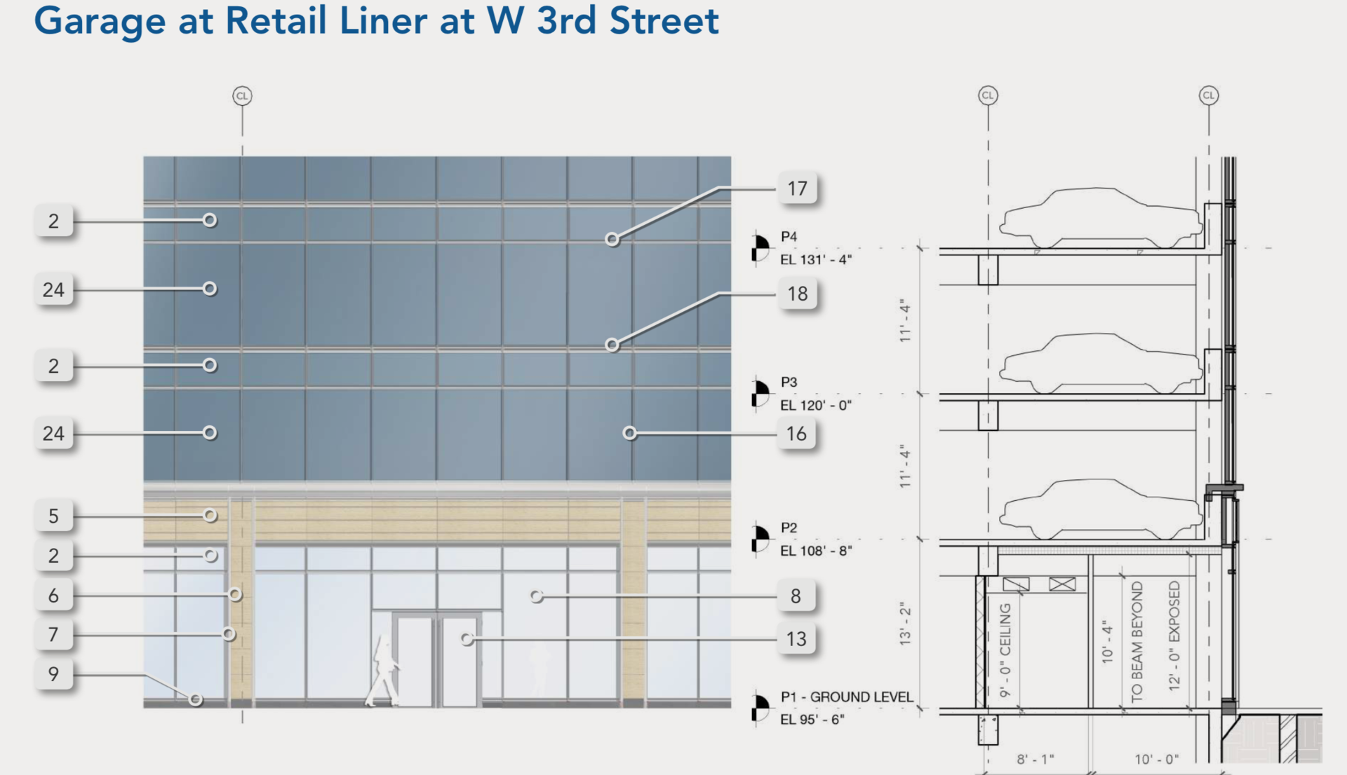
The parking structure is a little taller, but not that significant to be seen over the pavilion. The Pavilion levels are each 20 feet. The parking structure's levels are 11'-4" in comparison
-
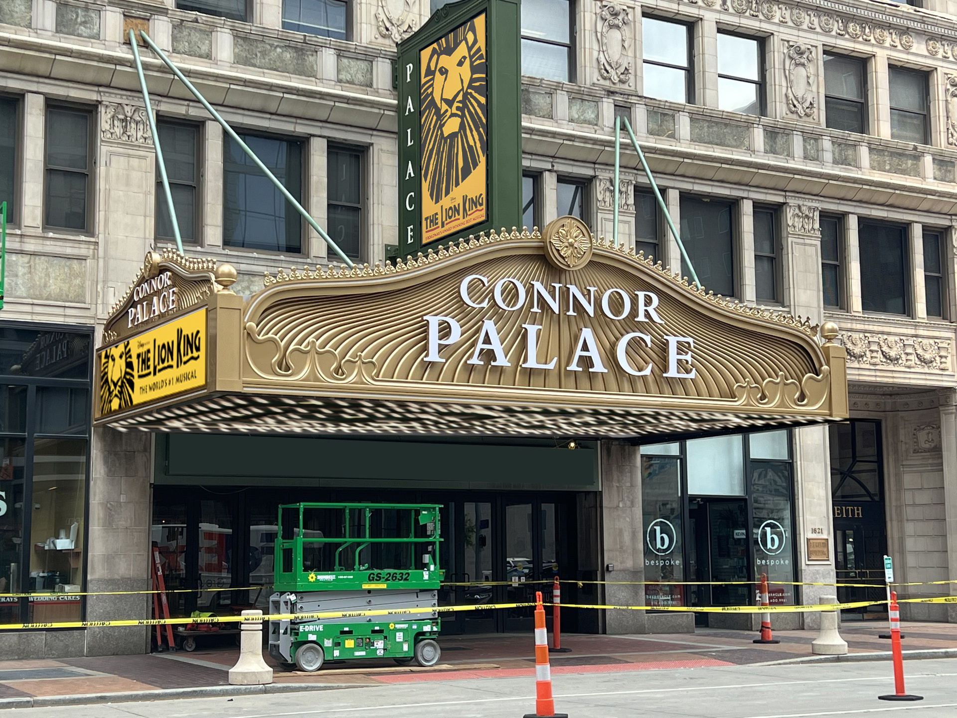
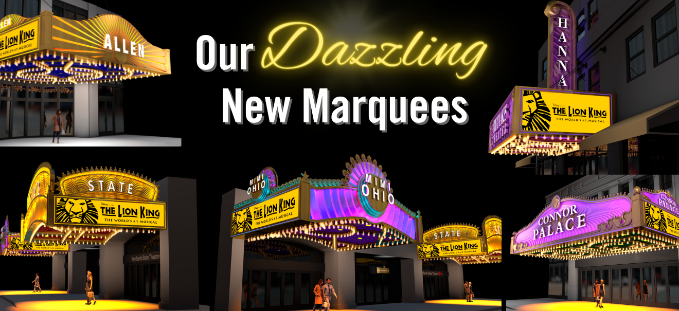
Thank you @GISguy for the photos . I was happy with the Connor Palace but as each of the following marquees were installed I questioned many aspects of the designs. They all have a heavy gaudy quality compared to the elegance that the marquees used to be. The individuality of styles made Playhouse Square feel more like a thriving theatre district and now more one note. I agree with @LibertyBlvd wondering why the lettering isn't the same on all.
-
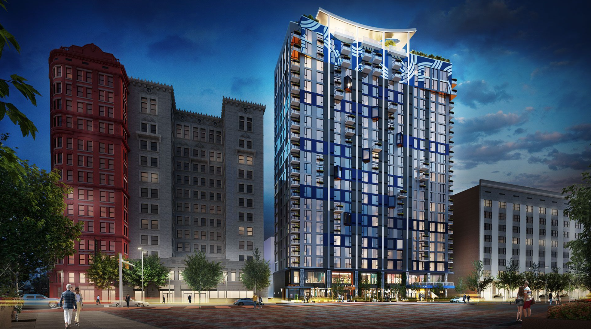
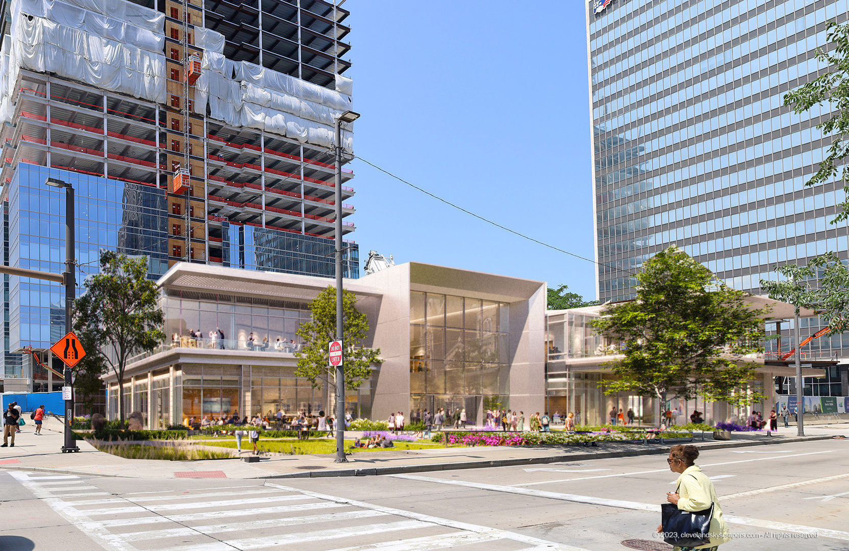
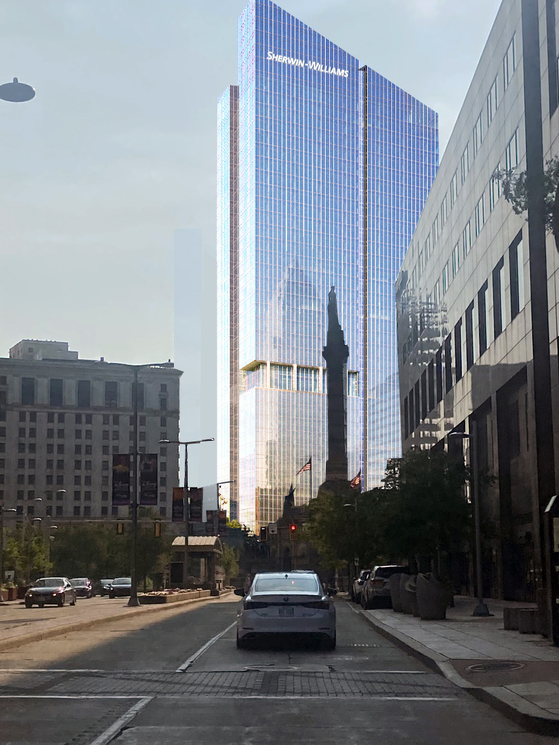
@MayDay. I hope you don't mind I used one of your photographs to overlay the pavilion onto the construction site.
-
Can't wait to see this lit up at night

-
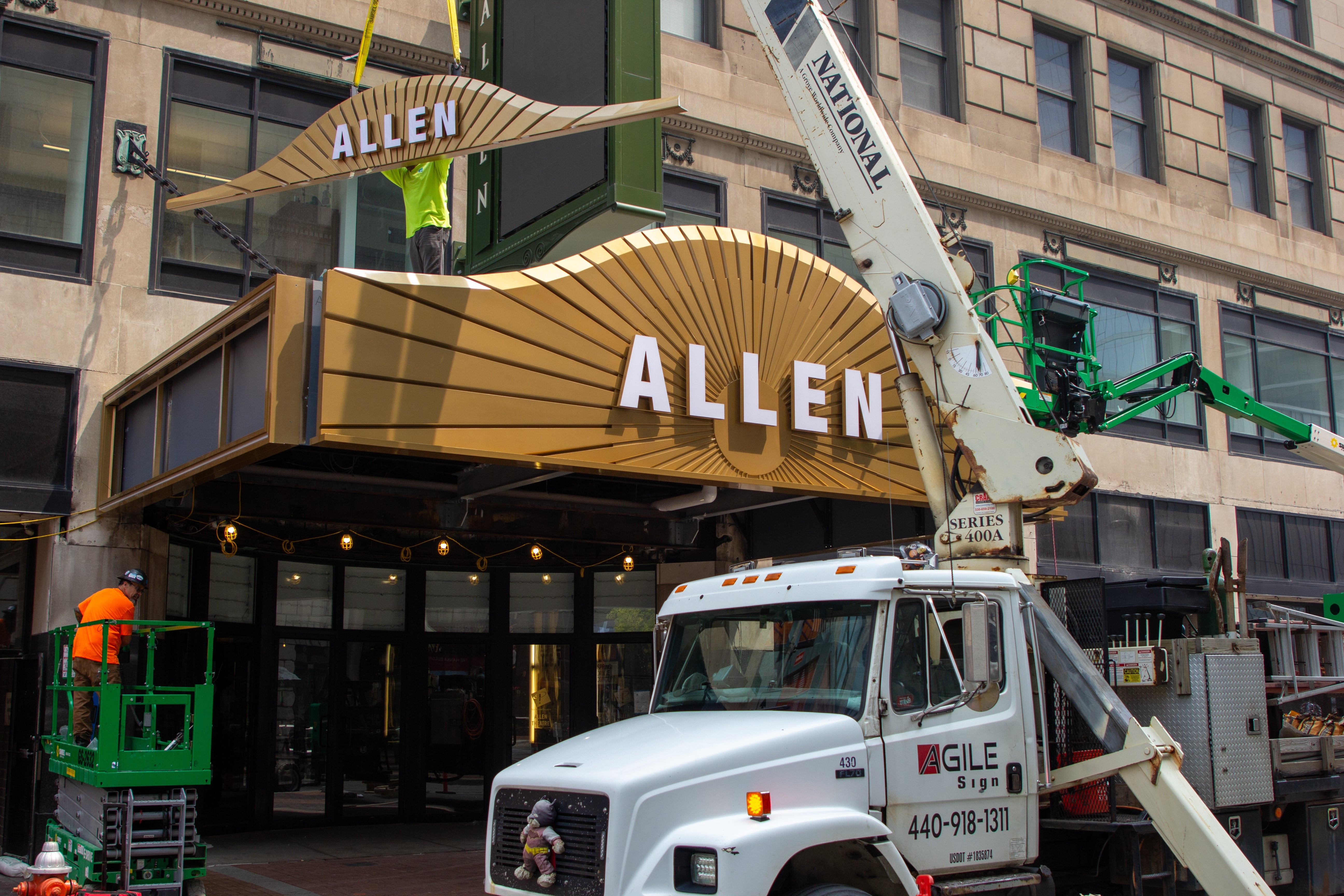
They are made out of aluminum with a powder coated gold finish
-
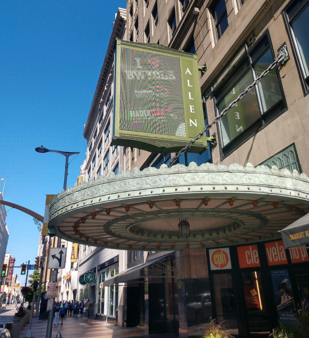
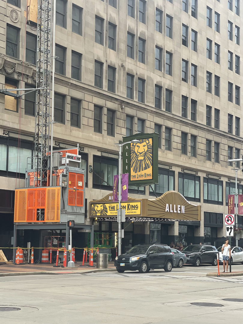
The Allen Theatre's round marquee was one of it's most distinguished features. I didn't think it needed a replacement. Why not just gilt it gold?
-
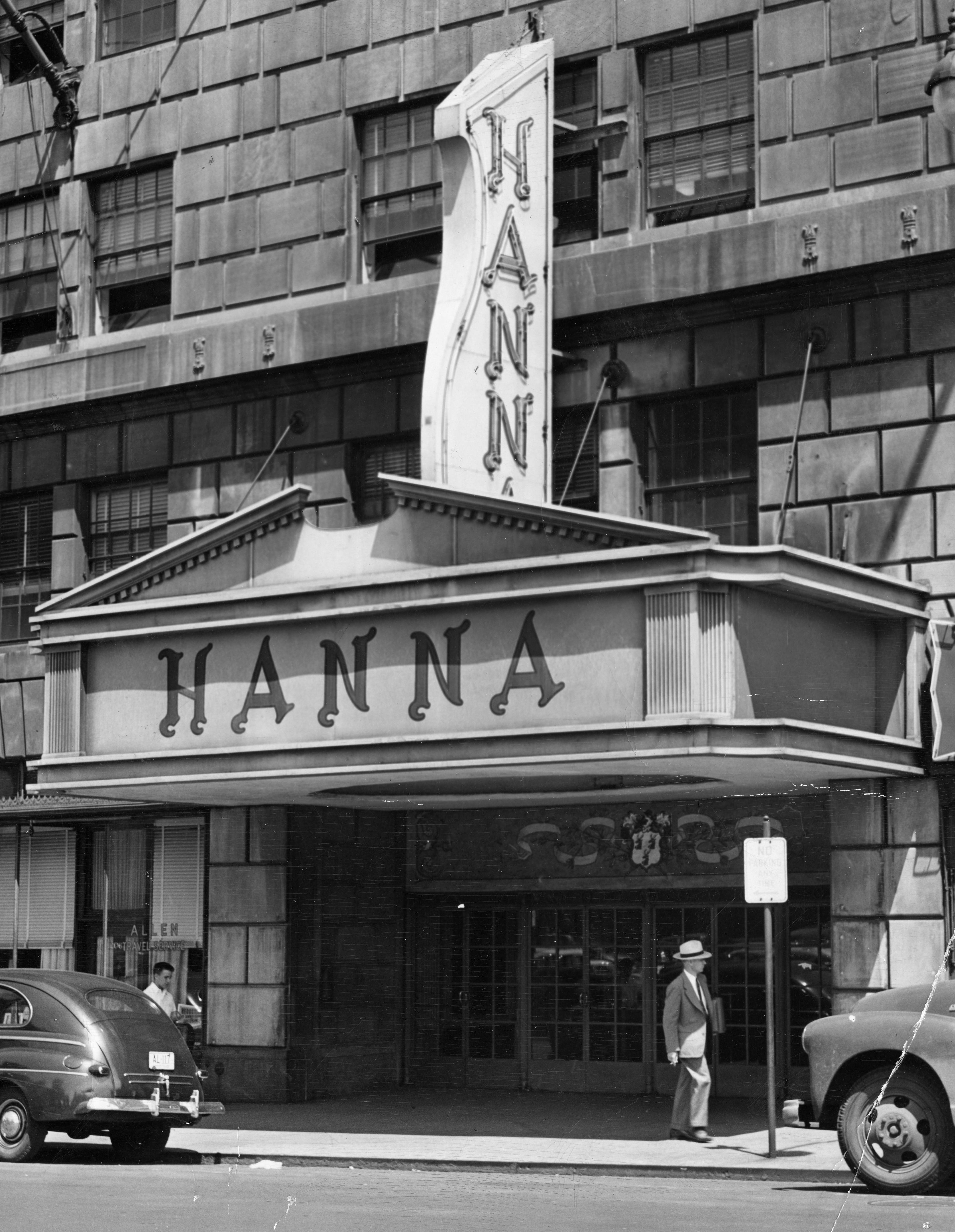
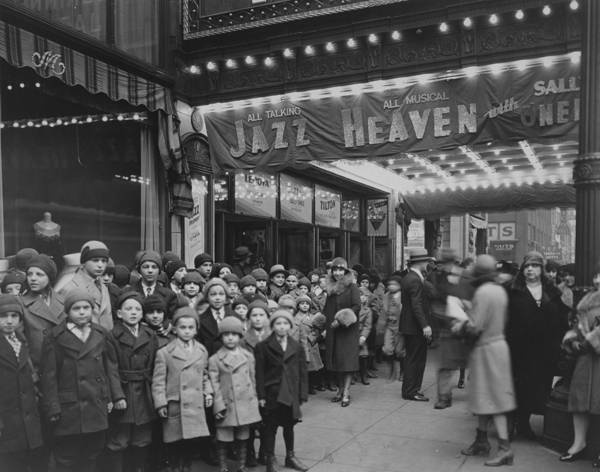
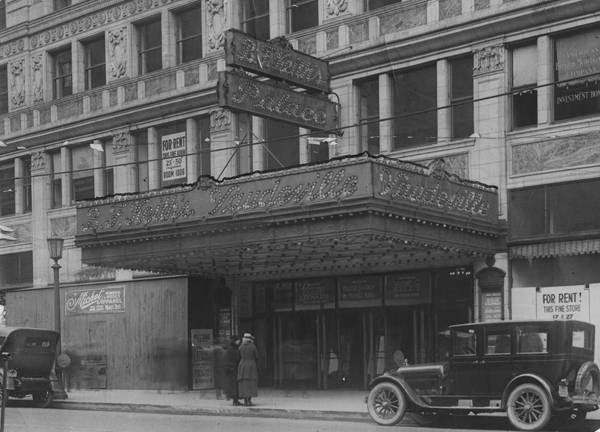
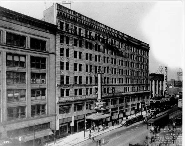
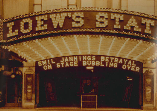
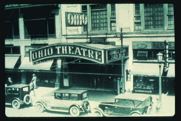
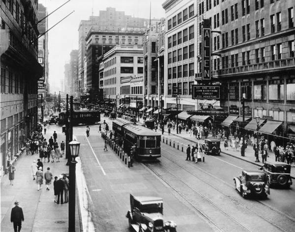
While I appreciate how Playhouse Square continues to invest in it's maintenance and development, it perplexed why The Allen, Ohio, and State were mimics of their historic original designs yet now were discarded. I always felt they were masters at historical restorations. These replacements try to be somewhat nostalgic but at the end lack the history of the old. Yes, the replaced Connor Palace marquee had no historic significance. I have attached photos from Cleveland's Memory Project so all can see how close 4 of the marquees were to their originals that are being replaced. The Palace could have been replaced with something that matched the original marquee linking the past to the present

-
I have photoshopped the underside of the installed marquees and all LED panels for all to see what they should look when completed during daytime conditions. Enjoy


-
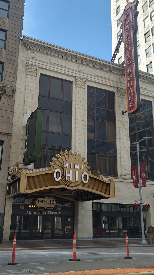
I played around with the Mimi Ohio marquee to try to fix the proportions . I think if hey could adjust the scale of the lettering in Ohio it helps to balance the aesthetic. I also played with replacing the inset color with a bronze rather than gold to allow the marquee to have some depth during the daylight hours
-
I don't know if the added detail is helping this design. Some notes I have. 1. The center "fan detail" ,above MIMI, feels top heavy and begins to encroach on the central blade sign 2. The "fan detail" on the marquee returns are very flat from this view. The same with the added stars 3. The size of Mimi Ohio lettering is under scaled to the marquee size I also miss that the State and Ohio had matching marquees which had a nice balance to the building. I'm afraid the same notes I have from this marquee I will apply to the State's
-
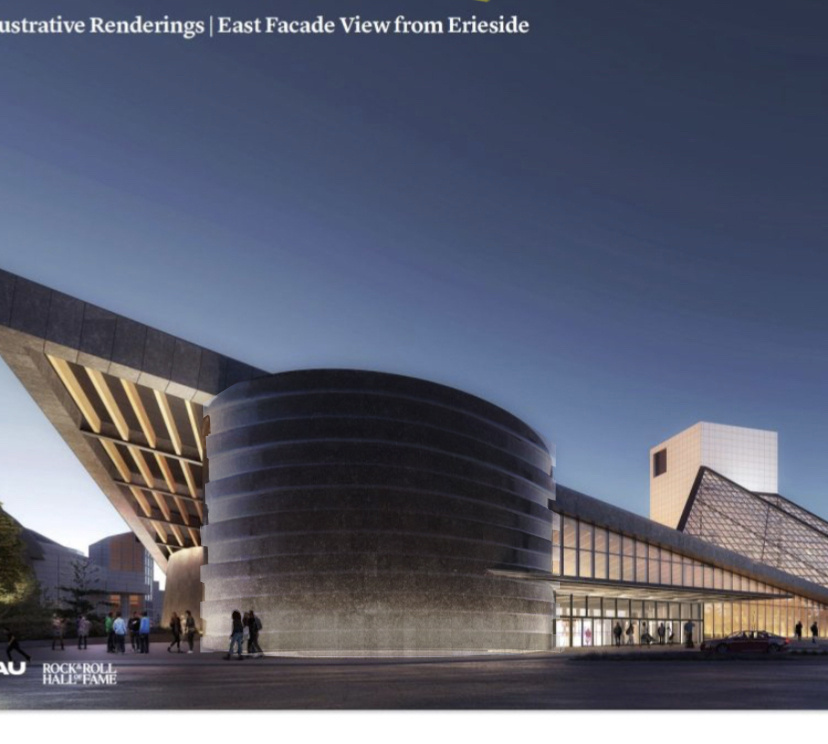
I also wish we could see how the PAU designed expansion could have some interior renderings to show. It is difficult to understand how the two structures blend or if there is a "clash"of finishes planned. The I M Pei design is light filled and the PAU addition feels dark.
-
What if they added grooved horizontal banding that had a stacked record vibe when uplit at night? Inside the banding they could engrave inducted members of the RRHOF or add iconic song names into the stone
-
So far the only one that appears to be elegant is the Connor Palace. Both the Allen and Mimi Ohio detailing lacks a layer of detail to match the grandeur of the theatre interiors. I don't understand why the font was chosen and why it is in just a straight line. Yes the old marquees needed some repairs but I don't know if these are better replacements that will age as well as what was already there
-
https://www.playhousesquare.org/news/detail/the-marquee-project This link contains images of what the new marquees will look like in the evening. Also, if you scroll down on this ling they continue to update the installation with photos.

-
https://www.cleveland.com/entertainment/2023/07/fahrenheit-nears-opening-in-downtown-cleveland-sneak-peek-photos.html Fahrenheit nears opening in downtown Cleveland – sneak peek (photos) I have to say the interior spaces are impressive
-
@MyPhoneDead Here is roughly what it would look like if moved to the Jacob's Lot.
-
@CleveFan. Thank you for the photos. I hope you don't mind I was compelled to do an overlay on one of your photos.

-
I favor the look of the Connor Palace's marquee over the Allen's marquee. The font used is very generic and wish it incorporated the serif font featured on the blade sign above it.
-
The Allen marquee installation
-
Thought I would add another photoshopped pic
-
It is odd how the electrical cord is routed/taped for the K&D Group sign! I hope they figure out a better method. Yet again that could just be construction/caution tape that needs to be cleaned up :)