chrino21
Dirt Lot 0'
-
Joined
-
Last visited
Everything posted by chrino21
-
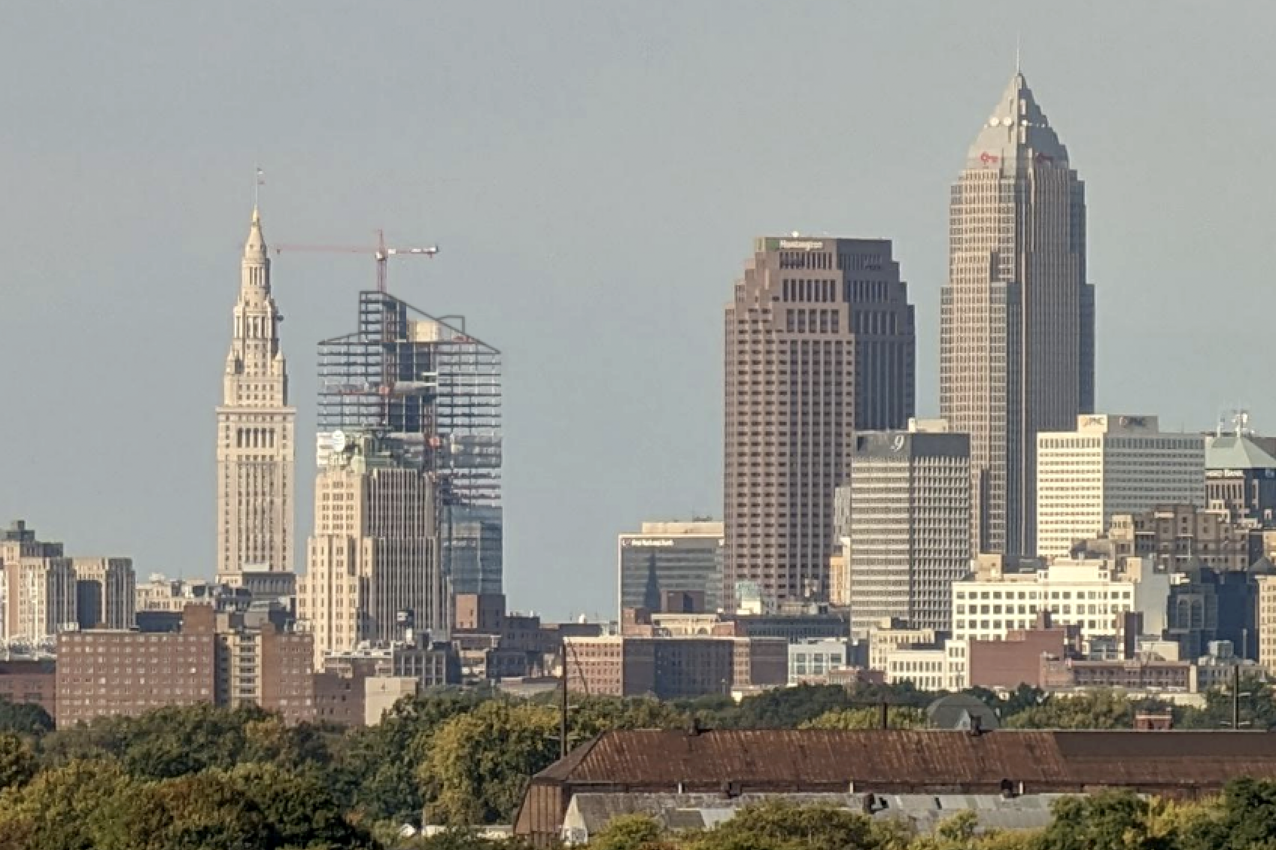
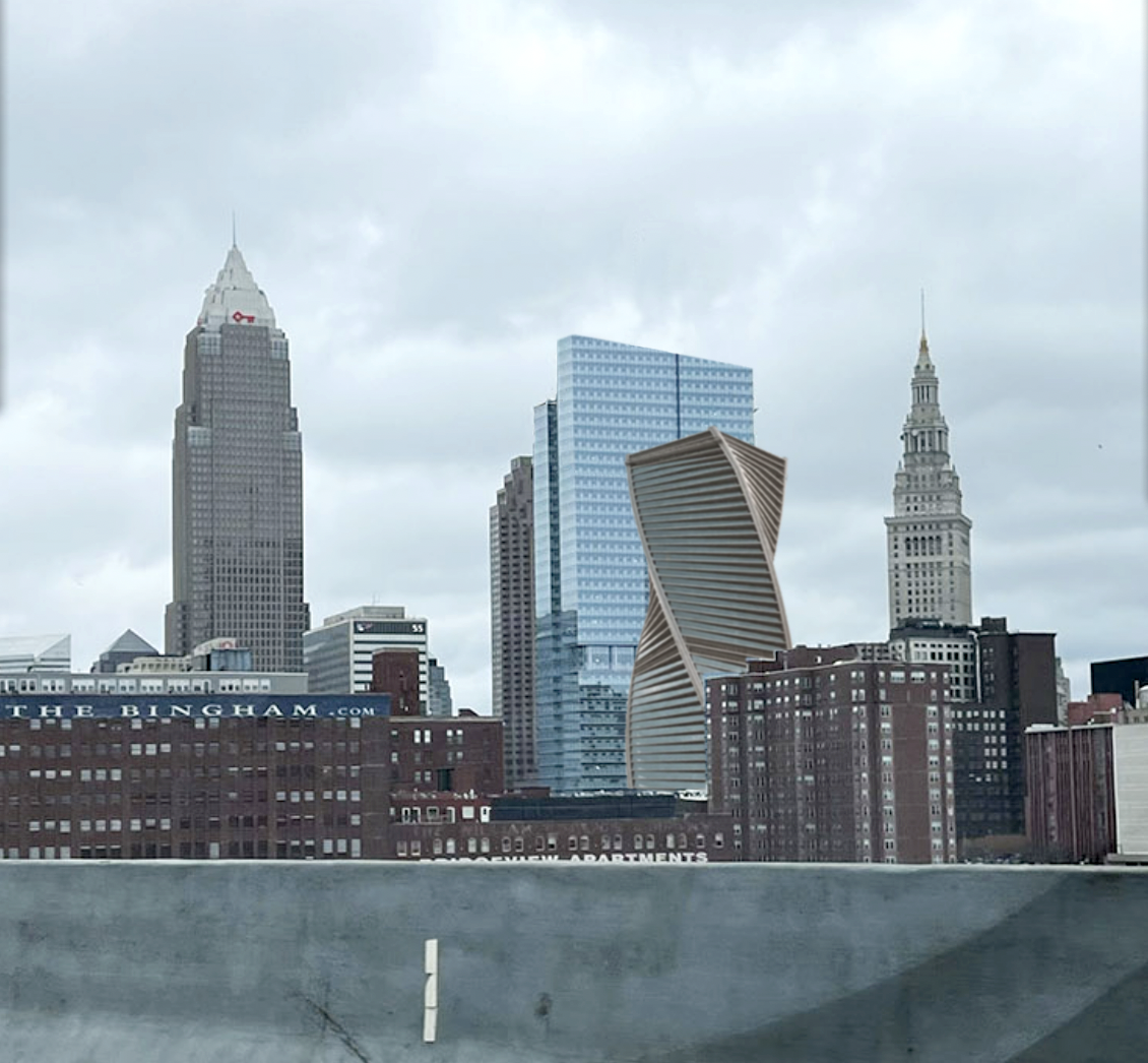
@CleveFan @Paul in Cleveland After CleveFan's perfectly stated comment on the previous page, I've come to the conclusion that for the good of a skyline-in-total, a completely different design "adds" more than a twin. So, I started fooling around with PaulinCleveland's photo again. I dunno, I think it beats the "dominating monolithic complex" look, as CleveFan so aptly put it. Not that I would think any developer would ever do this with their two buildings.
-
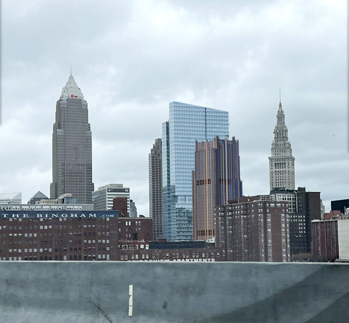
@Paul in Cleveland @MayDay Okay! Might as well, right? With props and all due respect to Paul in Cleveland (whose Shoreway pics I've looked forward to and have been my favorites), I just wanted to see what a second tower at roughly 28-stories would look like, so being 2200 miles away I have to use other folks' photos. I do so hope they make it different but related in some creative ways, as twin buildings seem to make each other look less slim and tall - "squatifying"? each other. See Philadelphia's Liberty Place, San Francisco's Embarcadero Center, etc. Anyway, for what it's worth... **Let me add, I see MayDay and more have contributed Shoreway pics, so I might not be crediting everybody.
-
@Silent Matt Very sorry, Matt! I had no intention of pinching credit for your photo. I'm just not real good at navigating this thing, as in I have no idea how to reply or call attention to the original poster (that was the first time I'd tried the @ symbol, and this is the second). I should have mentioned it like I did once before. BIG apologies! I've removed the photoshopped rendering with your photo, and hope you accept.
-
@CleveFan I've been wondering about this, too. It sure seems almost criminal to build your showcase HQ, then immediately block up to 1/4 of the views. Even a triangular footprint could greatly 'air-out' that grouping.
-
Several times I've looked at these beautiful photos and thought "Boy, I wish I had the commission on those giant post-it window covers..."
-
As near as I can figure...

-
a 5-minute PhotoShop contribution.
-
Might've been the flight I once had, CLE to LAX via PHI. smh
-
That "birdstrike" had me a bit distressed, so I went looking. Seems it's been there from very early on, perhaps even from the install. Earlier pics are a bit inconclusive, but somehow we've all been missing this for awhile. Sure hope it was human error and not the first of many strikes!

-
I'm no expert and I'm sure it will spark a huge debate, but I think they go up an extra floor or two for the elevators' machinery and/or roof access. Any elevator people?
-
Of course. I didn't say that's WHY it was built that way, I said that was the effect. And buildings of that era had a "back" and three viewable sides. If you'd like to see why I like this particular back, take a look at the back of the Rockefeller building and see what could have been staring at Public Square. I guess some people see a blank concrete wall and find the beauty in it, and other grab their spray paint and deface it.
-
Nope, no fight necessary and I certainly understand why it would bother some people, but I'm not being tongue-in-cheek. I love it. Frames those two older buildings beautifully, and it was a necessary architectural feature in that era in order to build that high. Doesn't bother me at all. Very unashamed, just like Cleveland.
-
I swore I typed "its" correctly! :(
-
Seeing these shots reminds me that the designers did one fantastic favor to the 55 building, both to those looking out of it, and those of us who love looking AT it. Such a beautiful building and example of its time, I'm glad it didn't get walled off. And I, for one, have always been absolutely in awe of the Standard Building's gorgeous blank wall - a monumental display of restraint showing deferential respect to the church as it frames it's ornate steeple. Such an example of class - I sure hope no one paints a goofy, immediately fading and peeling mural on that thing.
-
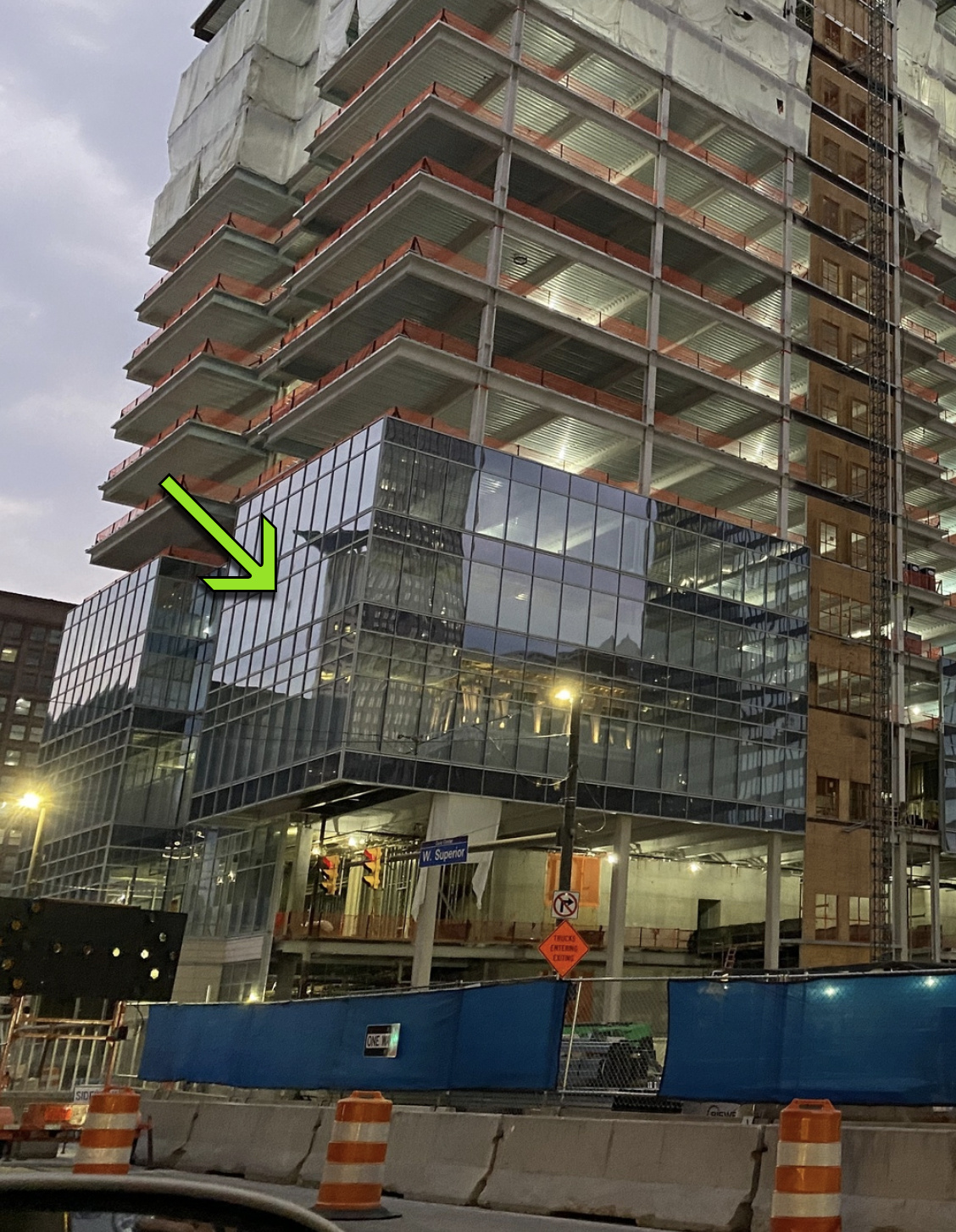
I've been wondering about the glass, but knew you'd get to it! :) AWESOME WORK!
-
There, fixed it a little.

-
...excuse the bad Photoshop
-
Way, way better than this - at least in my opinion.

-
Since you're asking... No, I personally wouldn't use a word like "delighted" to describe my thoughts on the glass, or the building itself. It's just glass. Like any mid-70's-era office building. It's a typical, Pickard-Chilton lazy design, like ALL their designs; a clunky box with an odd cut here or there, wrapped in mirrored glass so as to give the appearance of it being hip looking. But that look hasn't been hip since Owens-Illinois built their squatty, look-alike Toledo HQ. There are so many inspiring designs and engineering marvels going on in the architectural world now, which makes this one all the more disappointing. Lots of missed chances here, i.e. as I've mentioned before, the shallow, right-angled cut-ins will do nothing to "slim" the building, they'll just reflect the exact same-angled light as the rest of the surrounding glass face. The one thing they did get right though, was to set it back off the square a block, so there's that. And it's nice that there's a rare new building in Cleveland, and one hopes it will bring some people and a little life to the Square.
-
I think you're referring to me and others. I still think that, rather strangely, those first few panels of glass look VERY wavy when they show up in more recent pictures. It was kind of shocking, but most of the sections since then look just fine. I've always known that the building will be reflecting mostly sky, so things will look very good, if not gorgeous. I also think that having the window frames in a lighter color, rather than black, will look good once the building is mostly sky.
-
This is about the sweetest architecture story I've ever seen. Kudos to Sherwin Williams! Years ago, I rescued Destructa cat from Irishtown bend while taking pics of a fog bank sliding under the skyline. She had been dumped there, over the cliff. She turned out to be the sweetest, most social, most appreciative being I've ever known, and we spent 20 great years together. Give a hug to Sherwin from Destructa - may you two be as happy as we were!
-
Indeed I was - a different VISUAL dynamic, though I guess I wasn't clear. I agree that the lack of public amenities is disappointing.
-
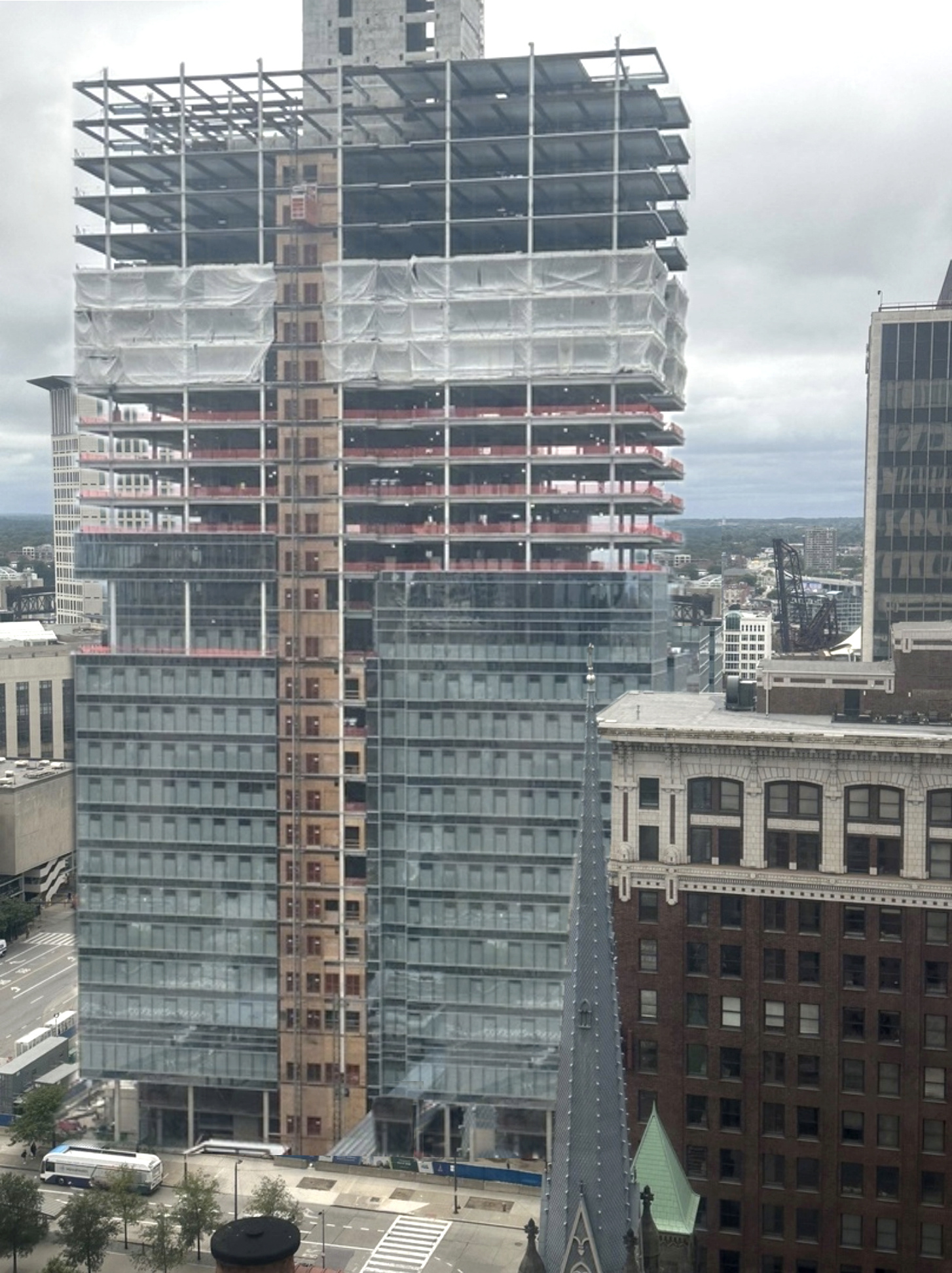
I think the angled top of the building and the angled footprint of the shack will combine to create some really interesting forced perspectives up close, and add a new dynamic to the Square. I was REALLY glad they decided to set the skyscraper back a block. When you think about it, the "Sohio" building sits back a short block, and the taper twins sit on the diagonal corners of the square, so really no tall building sits RIGHT on Public Square. Makes Public Square feel a little bigger. Just random thoughts...
-
Having lived in Boston and being transfixed by it, I always loved that building's 45-degree angled notch up each end. The way it reflected VERY different light than the rest of the building was almost magical. I was really bummed when SW went with 90-degree notches, as they won't really add any "unique" light to the building's appearance. Of course it's their call, what with floorspace concerns and all, but as an architecture fan I thought it was a major missed opportunity.
-
Sadly, yes.