anusthemenace
Metropolitan Tower 224'
-
Joined
-
Last visited
-
With the addition of more of the exterior cladding I can confidently say that this building is going to look great. Reminds me of some sort of fiesta ware.
-
Mediocrity holds sway!
-
Better yet.

-
Just tear it down and build something that actually looks good.
-
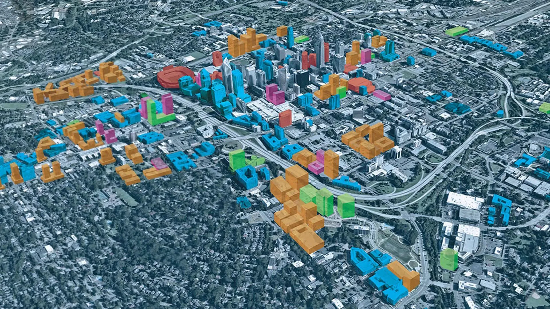
Blue is built. Green is uc 2025, orange and pink are uc 2026. Red is redesign required. Per OP.
-
Here's what's going on in the other "Queen City"
-
Morale is low fam.
-
It gets tiring that the state seems to be so willing to support development in Columbus over Cincy. Dewine needs to go. He's useless.
-
That was fast. The building was there yesterday.
-
Is it just me or does development seem to have stagnated in Cincy this year?
-
Kinda funny that the render doesn't show a hotel.
-
Someone had a few too many last night.
-
He's holding out for a Rainforest Cafe.
-
I don't take for granted how far things have come since moving here in 07, but the pace of development in Cincinnati is often painfully slow. I'm also pretty sick of everything proposed being downgraded in some way, from The Banks, to The Ovation, to the fact that the western part of TQL didn't get the lighting. It's as if half of the proposed projects here just get turned into something mediocre. It sucks to feel as if Cincinnati is still just a city on the outside looking in. Sometimes I want to move to somewhere more vibrant, but more so I just hope we can get our act together and see some positive growth soon. And if we don't cap FWW in the next 15 years I'll be pissed.
-
I actually think they're kind of cute. A better paint scheme would go a long way. The interior however leaves a lot to be desired.