July 27, 200519 yr Damn, I wonder what is taking so long. This is near where I live and it is painful to look at. It seems like they are stuck on this phase.
July 30, 200519 yr Convention center said on time and on budget Project overseers review income, spending, steel lawsuit By Marla Matzer Rose | Enquirer staff writer Despite a few hiccups, the $160 million expansion and renovation of Cinergy Center is on time and on budget, city planners say. The Cincinnati Convention Facilities Authority, chaired by Dan Meyer, gave an update at its semiannual meeting Friday at the convention center. Project director Mark McKillip said the work, scheduled for completion by the end of June 2006, is about 60 percent done. "We had a halftime pep talk last month," he joked. "We told the team we didn't want to lose it in the second half." Read full article here: http://news.enquirer.com/apps/pbcs.dll/article?AID=/20050730/BIZ01/507300331/1076/biz
August 31, 200519 yr I caught a blurb in the paper today saying that the convention center is 62 percent complete as of last week.
September 1, 200519 yr Center expansion on time, budget By Kevin Osborne | Post staff reporter A multimillion-dollar expansion of Cincinnati's downtown convention center is now 62 percent completed, and the project is on schedule and within its budget, city officials said. Only one other major convention is scheduled there during the next few months, in November, allowing work crews to kick off a period of intensive construction. During the first half of September, the large, white metallic letters that will spell "Cincinnati" on the facility's western side will be installed, forcing the closure of a section of Central Avenue for about a week. Also, crews are erecting a glass curtain wall and metal panels that will comprise most of the expanded building's exterior. Completion is set for Oct. 1. Work is under way to install new signs around the site, formally renaming it as the Cinergy Center. The main sign, at the corner of Fifth and Elm streets, was installed last week. So far, about $82.5 million of the project's $145 million cost has been spent or committed. Begun in April 2004, the expansion should be completed by June 2006, said Mark McKillip, the city's project manager. Read full article here: http://news.cincypost.com/apps/pbcs.dll/article?AID=/20050901/NEWS01/509010349
September 26, 200519 yr Windfall for Cinergy Center Higher tax receipts mean less debt for expansion project Dan Monk | Senior Staff Reporter Hotel taxes pledged to the expansion of Cincinnati's downtown convention center are coming in about 10 percent higher than originally projected. That could lead to early retirement of bonds issued for the project, a faster expansion of Sharonville's convention center and the cancellation of a $10 million loan from the Cincinnati Equity Fund, one of three major corporate contributions to the Cinergy Center expansion. When city and county officials committed to the $145 million expansion in 2002, they enacted three new bed taxes totaling 2.5 percent inside city limits and 3.5 percent in the rest of the county. For the 18 months ended June 30, those taxes generated $10.3 million in revenue, or $930,000 more than the project's financing gurus originally forecasted, according to a quarterly report of the Convention Facilities Authority for Hamilton County. Read full article here: http://cincinnati.bizjournals.com/cincinnati/stories/2005/09/26/story4.html
September 26, 200519 yr I remember living in Louisville and thinking that the city wanting to put up a large, purple lit sign on the riverfront spelling "LOUISVILLE" was the tackiest idea ever. I was wrong. Those letters on the convention center look like a 3rd grade art project.
October 10, 200519 yr I just looked at the renderings on cincyimages, and the Cincinnati spelled out accross the front looks like when they syrafoam cups in a chainlink fence. What are the architects thinking?
October 10, 200519 yr They have the marquee up on the Central Ave. side now. The marquee is a lot bigger than what I thought it would be.
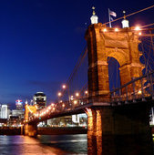
October 11, 200519 yr i think it looks pretty sharp on that corner. ill admit like most of you i think the lettering looks like garbage...but only when viewed perpendicular to that facade. its not very dramatic seeing it going south on 75 but i was driving back from tennessee last night and saw the whole thing lit up comming off the brent spence and it was very impressive. from that particular angle the the whole building looks nice, especially at night
October 11, 200519 yr I was driving into downtown last night on the 6th St. viaduct, and I have to say the lit up "CINCINNATI" sign looks pretty freakin' sweet. I didn't have my camera, but I will next time. It looks better from further away, but does not look bad at all up close.
October 11, 200519 yr Yeah, I give the "CINCINNATI" sign two thumbs up also... I believe it was meant to give a modern untraditional look up close. When that whole area is finished and the streets are cleared up and the tress go up it will probably look a lot better. The only thing I don't like the is the lights lighting up the "CINCINNATI" are different tones? This will probably be fixed once it is finished.
October 12, 200519 yr I have some taken from Mt. Echo Park that I might post soon. It's during the day, though, but it's a straight-on shot of the thing.
October 12, 200519 yr i was getting off at 5th on my way home the other night and the green flowing led sign is insane. it looks really cool, but i'm sure it makes living on 5th street at night annoying. i know MED has some lofts across the street and i bet those tenants all enjoy a nice green glow through their windows. i'm sure the fire dept loves it too
October 17, 200519 yr Yeah, I give the "CINCINNATI" sign two thumbs up also... I believe it was meant to give a modern untraditional look up close. When that whole area is finished and the streets are cleared up and the tress go up it will probably look a lot better. The only thing I don't like the is the lights lighting up the "CINCINNATI" are different tones? This will probably be fixed once it is finished. They've fixed the lights.. I just passed it last night, and other than the middle of the T, I belive it's finished. Looks pretty awesome too, I think.
October 17, 200519 yr Yeah, I saw where they fixed the lights. It looks pretty cool, especially when you are heading southbound on I75 and coming onto the 7th St. exit on I75 southbound. Now, I can't wait until the streets are revamped in that area!
October 26, 200519 yr Alright, this thing is already starting to pay off! Cinergy Center lands national convention Black law enforcement group coming this year By Marla Matzer Rose | Enquirer staff writer The Greater Cincinnati Convention and Visitors Bureau this morning will announce the National Organization of Black Law Enforcement Executives as the first convention that will occupy the newly renovated Cinergy Center downtown. A yearlong $160 million expansion and remodeling of the center is scheduled to be completed in June. The Washington, D.C.-based group, which had planned to hold its weeklong convention in New Orleans, is likely to attract national attention with its call for the creation of a new federal entity to deal with the needs of "first responders" in national emergencies. The convention is significant for Cincinnati because of its size - more than 5,000 are expected to attend - and because of the high-profile nature of its subject matter this year. Read full article here: http://news.enquirer.com/apps/pbcs.dll/article?AID=/20051026/BIZ01/510260312/1002/BIZ
October 27, 200519 yr It's hideous, at least the outside is. Change that facet of the building ASAP. I can't believe that design was approved. It seems someoen 60+ years old designed That. This is the 2000's not the friggen 60's. I sware it looks like somethiing from the brady bunch. MAybe it looks better at night, but in the daytime ewww.
October 27, 200519 yr It's hideous, at least the outside is. Change that facet of the building ASAP. I can't believe that design was approved. It seems someoen 60+ years old designed That. This is the 2000's not the friggen 60's. I sware it looks like somethiing from the brady bunch. MAybe it looks better at night, but in the daytime ewww. Completion, June, 2006.... they have a few months to go.
October 27, 200519 yr It's hideous, at least the outside is. Change that facet of the building ASAP. I can't believe that design was approved. It seems someoen 60+ years old designed That. This is the 2000's not the friggen 60's. I sware it looks like somethiing from the brady bunch. MAybe it looks better at night, but in the daytime ewww. Completion, June, 2006.... they have a few months to go. I believe the outside is mostly done. It's the inside that still has the most work to be done. The outside is growing on me. I do like the lighted "CiNCiNNaTi", but I thought the facade wouldn't be so dark/black.
October 27, 200519 yr It's hideous, at least the outside is. Change that facet of the building ASAP. I can't believe that design was approved. It seems someoen 60+ years old designed That. This is the 2000's not the friggen 60's. I sware it looks like somethiing from the brady bunch. MAybe it looks better at night, but in the daytime ewww. I sort of feel the same way, but have to welcome modern architecture. I personally like the 80's granite and red feactures, it looks very upscale.
October 27, 200519 yr I love the new Cincinnati sign on the side of the convention center. It gives the city a life it didn't have before on that side of downtown. When driving past on the highway it appears to be a vibrant area and smacks you in the face that you are in Cincinnati. Given a convention center usually kills urban life in that region the sign makes it appear as otherwise....I LOVE IT!!!
October 27, 200519 yr I have some taken from Mt. Echo Park that I might post soon. It's during the day, though, but it's a straight-on shot of the thing. I want to see!
October 28, 200519 yr Well, it's not as good of a photo as I thought. But you can see the letters. I don't have any night shots.
October 28, 200519 yr That sure is funny lettering, some capital, some lower case, but all the same size. Looks sort of like a score board.
October 30, 200519 yr Author Guys I have to admit, the letters have grown on me. I think it looks good at night and I could see it when I landed at CVG last night from around 10,000 feet and could make out what it said. I also like the green ticker that scrolls on the corner.
October 30, 200519 yr The letters are a bit odd. It would be nice if they had used a more attractive "font", as it were.
October 30, 200519 yr The letters are a bit odd. It would be nice if they had used a more attractive "font", as it were. Thats what I was getting at. Anyway, in 30 or so years they will be ripped down, so why worry?
October 30, 200519 yr Author It all looks lowercase except the "T". It would be simple to adjust the two end pieces of the "T" one level down. Anyone have any thoughts on this?
October 30, 200519 yr Yay, an easily-Photoshopped picture! Lowercase T: Still looks a bit off to me, I guess because of the proportions of the letters, although I think I prefer slightly over the original. Uppercase I's and A (something I was thinking of): I like this a bit better, except 1) the N's can't be uppercase when they're only three panels wide, and 2)like most all-caps text, it's harder to read.
October 30, 200519 yr Author You rule Pigboy. I like this one so much better than the original. Someone submit this to the developer and ask him to change ASAP!
November 6, 200519 yr The "T" is enclosed in glass. I guess you could say it's inside the convention center. I'm curious what the lighting plans are. Special occasions only?
November 6, 200519 yr Looks goofy. The only reason I can think to do something like this is to remind people that there are two "n"s, not two "t"s.
November 14, 200519 yr City to seek bids for Cinergy Center manager By Marla Matzer Rose Enquirer staff writer With the completion of the renovated Cinergy Center less than eight months away, it still isn’t clear who will run it. The city of Cincinnati plans to issue a request for proposals Tuesday from companies that could manage the downtown convention center. Interim city manager David Rager suggested seeking an outside management firm in a detailed report presented to City Council on Wednesday. In September, the Greater Cincinnati Convention and Visitors Bureau and the Cinergy Center’s management proposed a new nonprofit city-Hamilton County entity called the Convention Facilities Authority, which would manage the center. Read full article here: http://news.enquirer.com/apps/pbcs.dll/article?AID=/20051110/BIZ01/311100013
November 14, 200519 yr I love it though uppercase looks better. You should see it lit up from queens tower or summit view over in east price hill. Look's freakin awesome from a distance.
November 18, 200519 yr I think once they complete the construction on the street (i.e. trees, etc...) It will be a whole lot different in a positive way. I hope they take down those street signs and traffic lights. I feel that the signs hanging from poles verses cables will look a lot better.
November 18, 200519 yr Is there anything facing the sidewalks on 5th or Central besides giant blank walls?
November 18, 200519 yr Is there anything facing the sidewalks on 5th or Central besides giant blank walls? Considering the main entrance is on Elm St., I wouldn't think so.
Create an account or sign in to comment